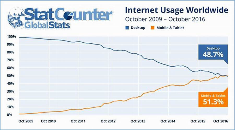
Mobile phones- almost everyone has one, and at no surprise considering the amount of accessibility and ease of use that comes with them. Did you know that 52% of global internet traffic comes from mobile devices? This means that 1 in every 2 people that visit a website are viewing it from a mobile device, instead of a traditional desktop computer. When we dive even further, we learn that 60% of Google searches are made on mobile devices, compared to 34% only 7 years ago!
In this blog post, we are going to be discussing how and why mobile should come first and how it affects your business, no matter whether it operates locally, nationally or internationally. We are also going to be focusing on mobile-first from a web design/development and UX standpoint.
What Is Mobile-First & Why Is It Important?
In a world that is increasingly becoming more reliant on mobile devices for ways of communication, shopping and day to day life, it only makes sense that your website should be focusing on where the attention is heading towards.
The mobile-first approach ensures that you are delivering the right user experience, whilst prioritising the elements of the website/web pages in order for them to be compatible with various screen sizes and on various mobile devices. It primarily involves designing a desktop website starting with the mobile version, which is then adapted to suit a variety of larger screens.
Web development and design for mobile devices is often harder than desktop and bears more issues in its creation. By focusing on mobile-first, then desktop and other devices, it prevents the issue of having to restructure the mobile content, if, for whatever reason, the responsiveness was not working after the desktop counterpart was created.
When you design from a smaller screen (mobile device) to a larger screen (desktop) this is known as “progressive enhancement”, which allows you to start designing with a strong foundation and build up from there, adding enhancements as you go.
It is important to note that the mobile-first approach is different from mobile-first indexing, which involves the search engines crawling mobile versions of websites first, then desktop. The mobile-first approach is focused on web design/development and UX (user experience).
Another importance of mobile-first design is that it forces you to really focus and maintain clarity when creating your website. By removing any potential distractions, such as unnecessary user interface decorations, you will be able to improve the user experience and that makes good business sense.
3 Reasons Why Your Website Needs To Adopt Mobile First
Did you know that in 2016, mobile internet usage surpassed that of the desktop? More and more people are searching and browsing the web from their mobile devices, which only further supports why your website needs to adopt a mobile-first design. As you can see from the graph below, desktop usage has been on a steady decline, whilst mobile is continuously on the rise, year after year.

#1 Google Indexes Mobile First
Since July 1st, 2019, Google has been predominantly using the mobile version of a website's content for indexing and ranking. This is because more Google searches are made on mobile than desktop, so it only makes sense that they would opt to crawl mobile-first over desktop. So, what does this mean for your website? It means that if your website is not optimised well for mobile, then it could be at a disadvantage.
You will be able to see within Google Search Console, the date for which Google switched from indexing and ranking your desktop site to your mobile site.
#2 Faster Loads Times
By starting the design/development/UX with a mobile-first approach, it is supposed that images and layouts can be properly optimised for the small screen size, which will have a direct improvement on page load time and site speeds. Did you know that a 100-millisecond delay in load time can cause conversion rates to drop by 7%? Faster load times mean more time spent on your website, which results in reduced bounce rates and an overall increase in user experience.
#3 Mobile Is The New Desktop
With just over 60% of Google searches being made on mobile devices, and 50% of total internet searches, it is fair to say that mobile is becoming the new desktop.
Now, the desktop is not going away anytime soon, but the statistics are showing that mobile is continuing to grow, and growing fast! With platforms such as Facebook & Instagram being used predominantly on mobile devices and more than 88.9% of Youtube watch time coming from mobile devices, it is incredibly easy for people to open a new browser tab on their phone and search up whatever they need, quickly and efficiently, without the need to head over to a computer or laptop.
Conclusion
So, is your website optimised for mobile? Remember, mobile-first is something you should heavily consider for your website because not only will it increase page load speed, conversion rates, and user experience, but because Google indexes mobile-first.
At VEVS, all our websites are optimised for mobile and use responsive design technology, so you can rest assured that your website is going to take advantage of fast page speed and load times, great user experience and have everything from imagery to layouts fully optimised, so your customers can browse your brand new website with ease! Plus, it also gives the website an SEO boost. Given the speedy rise of cross-device shopping and m-commerce, facilitating online purchases on our sites through quick checkouts and fast load times is one of our top priorities.

Are you following us on Facebook? Click here to like our page and be notified whenever we publish a new blog post!
Have you read our blog post on How To Get Traffic To Your Website Using These 5 Offline Marketing Methods?
If you are interested in finding out how VEVS and our team of experts can help your business when it comes to marketing, please visit our digital marketing page for more information.


