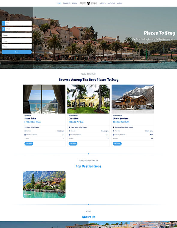
Web design, it can make or break a website. It holds influence over credibility, conversion rate, bounce rates, page views and almost every other measurable factor. To a certain extent, web design is looked at as subjective, because it is exactly that...design. Much like fashion, what one person finds incredible, another may find boring and dull. There are however some web design implementations that are backed by research and we highly recommend you take advantage of them within your website. In this blog post, we are going to go over 7 web design tips you need to implement for your website.
What Is Web Design & Why Is It Important For Your Website?
Before we jump right into the weight of the article, it is really important that you understand what web design truly is and the role of importance that it plays.
According to Tech Terms, ‘Web design is the process of creating websites. It encompasses several different aspects, including web page layout, content production, and graphic design. While the terms web design and web development are often used interchangeably, web design is technically a subset of the broader category of web development.’
Web design is highly important because it is this very design that a potential customer or a web user sees when they visit your website. The impression that they receive can either get them to remain on your website and learn about your business or leave your website and turn to one of your competitors, resulting in a lost customer.
Not only is your website design a reflection of your brand image, but it is also a tool you can use to optimise the buyer's journey, the impact on your conversion rate and much more!
#1 Keep Things Simple!
Yes, that’s right, keep things simple! Humans can often have a tendency to overcomplicate things but remember sometimes the basics work just fine. A study by Google shows that users prefer fewer complexities, meaning it may be time to ditch that distracting sidebar or constantly revolving carousel.
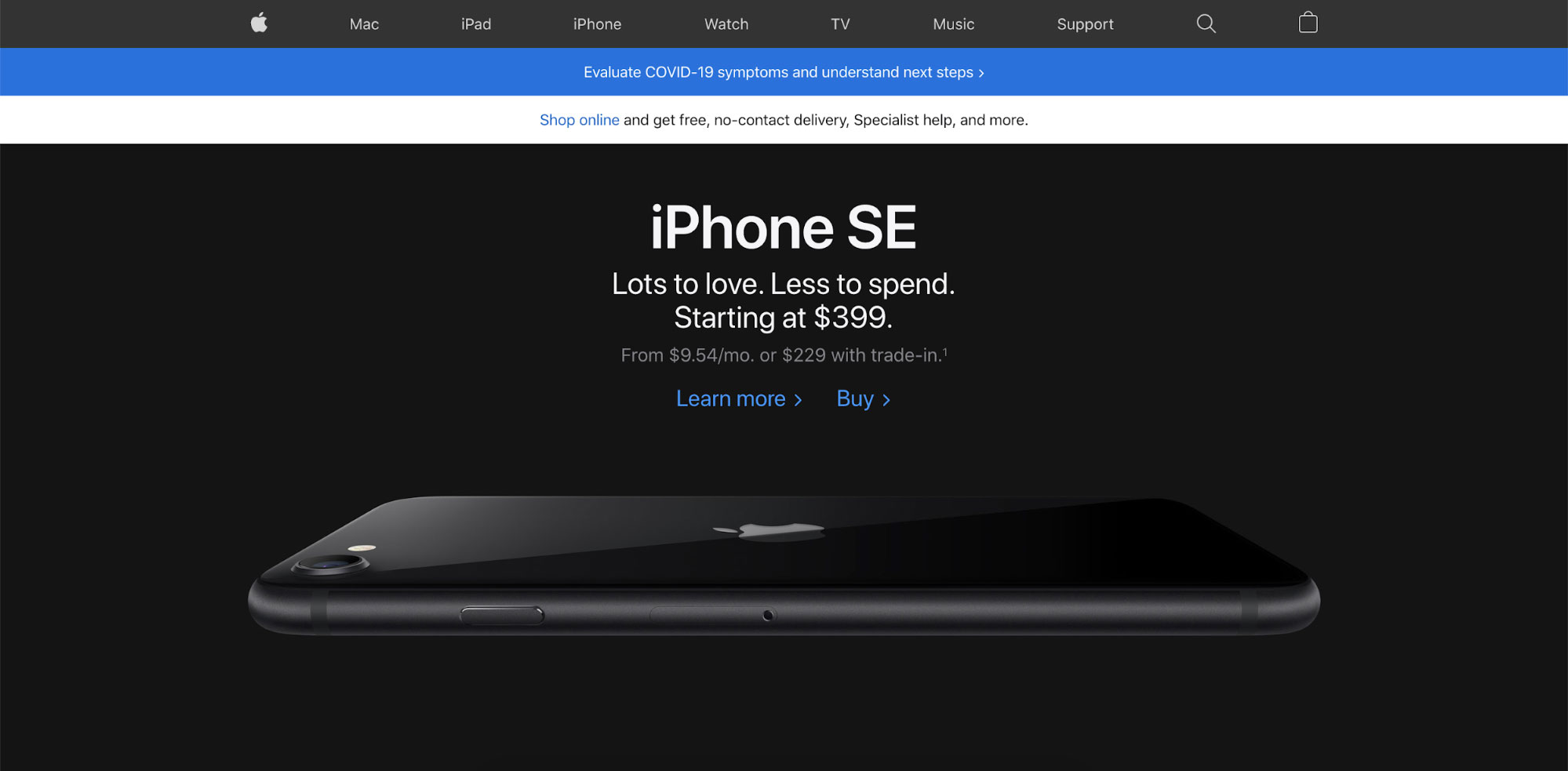
Look at Apple.com as an example. Their website has a very simple layout, yet proves highly effective for them, because users can easily find what they are looking for, whilst appreciating the design aesthetic. There’s a reason they decide to operate this way.
#2 Site Speed Is A Key Priority
Site Speed- a factor proven time and time again as a big factor in web design. Site speed can impact everything from bounce rates to conversion rates, to even a user's satisfaction when viewing the site.
To give you an idea of the relationship between site speed and web design, think of them as bread and butter. They both go perfect together, and yes, they may be able to function independently of one another, but when together, everything is better! As site speed reflects how quickly a website responds to web requests, slower speeds result in the code of a webpage taking longer to load and display, meaning that all your hard work of designing your website goes to waste, because it never ends up loading in time for users to stick around.
Another thing to consider is that when it comes to web design, speed depends mostly on the technical side of the website, such as the HTML, CSS, Javascript etc. Website owners usually have very little control over how to improve their website site speed.
In addition to this, the design and page layout depend on the content you wish to add within a webpage. The more images or the fancier the visual effects, the bigger the page size and the slower the page load time.
With that being said, it is important to find a balance between the technical aspects of a website and the visual, design aspects. You can have the fastest loading website on the world wide web, but if it lacks sufficient content and good design, it quickly becomes useless. So a balance between site speed and content used within web pages is needed, but always strive for a website that has fast loading times. It is ultimately better for users and will reduce that ‘oh so annoying’ bounce rate.
Research shows us that if your website is slow, then people are just not going to stick around. This is something that search engines pick up on, therefore they measure site speed as a ranking factor. Unfortunately, if your website is incredibly slow, don’t expect to see your site within the top of the search results anytime soon.
#3 Responsive Design
That leads us nicely onto our next tip- responsive design. Responsive web design is an approach to web design that makes web pages render well on a variety of devices and window or screen sizes. Websites that do not offer responsive design often fall short of providing a great user experience no matter what device the user is visiting from.
A website that does not cater for responsive design may look great on desktop with a standard viewing screen size, however once viewed on mobile, this may be far from the case. The webpages could become overextended, with the text being cut off or the navigation menus inaccessible. What’s landscape on a laptop, must become portrait on a mobile phone, and responsive design makes sure that this can be achieved.
With 63% of US Google searches being made on a mobile device, this means that websites that are not adopting responsive design, risk losing customers and bearing the burden of high bounce rates.
At VEVS Business Software & Website, all our website templates use responsive design technology, as we understand that this is a crucial design element, and one that must be taken into consideration. We want to make sure our clients can offer the best possible experience and service for their customers, just like we strive to do for them.
#4 Leverage The Fold Of Your Site
The fold is regarded as the part of the webpage that is first visible when you click into it. For example, if you scroll up and look at the image of Apple’s homepage, that is an exact snippet of the fold on their website, when viewed on a 13 inch laptop screen. Anything below that is regarded as the rest of the web page.
There is a debate as to whether or not the fold still really exists due to the range in devices and their different screen sizes. However, saying that, a study conducted in 2018, found that users spent 57% of their onsite time above the fold, with a sharp decline the more the web page scrolls down.
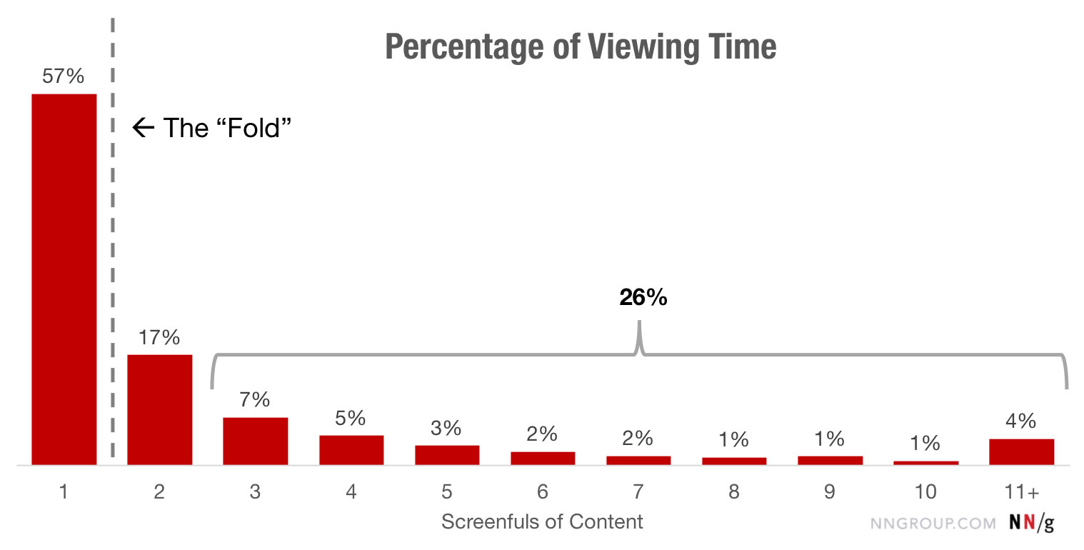
So, what does this mean for your website? Well, it means that you should be displaying your most important information higher up in the webpages. For example, place your email newsletter sign up form within the first two ‘screenfulls’ of a webpage, rather than near the footer. Another good practice is to have the ‘call to action’ within the upper fold. This will make sure that it is front and center and easily seen by users.
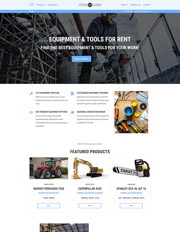
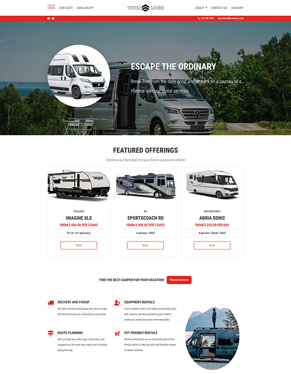
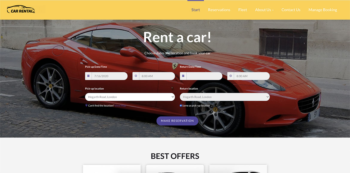
At VEVS Business Software & Website, we make sure that these rules are followed within our website templates. For example, our car rental template below includes an online reservation form within the upper fold, making it incredibly easy for our clients' customers to book their rental vehicles.
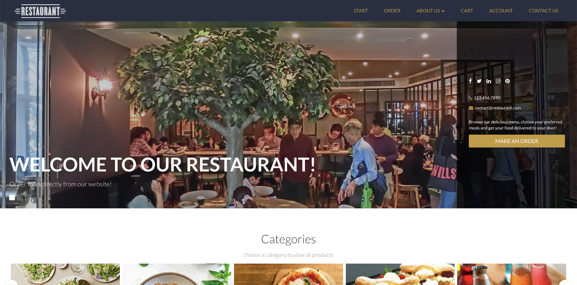
Another example can be seen in our Restaurant website templates. As you can see from the image below, the call to action button and relevant contact information, such as email, phone number, social media etc. and all placed within the upper fold.
For more information, visit vevs.com where you can start your free one week trial.
#5 Leverage Social Proof
Social proof is an all important degree of information users look for when visiting a website. It is what helps them to trust the site and shows whether or not customers that have purchased enjoy the product or service. If you can show that others have a positive opinion of your site, content, product or service, new visitors are more likely to do the same.
Some of the best ways to show social proof include, social shares, reviews/testimonials and media mentions.
#6 Use People in Pictures
Humans are a very sociable species, so it only makes sense that we like to connect with others. Showing pictures of people within your website will help to not only make people feel more at ease, but also to potentially increase your website conversion rate.
This case study by Basecamp discusses how they were able to increase their conversions by 102.5 percent, by simply switching over to an image based background, as opposed to their previously used text based landing page.
#7 Implement The Power Of Hick’s Law
Hick’s Law states that the more choices a person has, the longer it will take for them to come to a decision. This is something that is displayed time and time again on websites all across the web. A lot of businesses make the mistake of thinking more is better, and they try and offer as much as they can, unbeknownst to them that this could actually be driving away customers.
A brilliant study was conducted to showcase this and the results of the study can be easily seen from the graphic below.
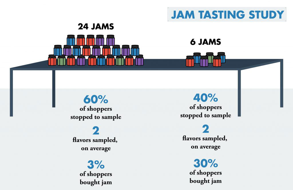
As you can see, the study variation with 24 jams resulted in the lowest purchase rate out of the two variations, with only 3% purchasing, as opposed to 30% when only 6 jams of choice are displayed. This creates a direct correlation between choices and buying decisions. So, next time you are thinking about increasing your products or services, ask yourself the question, “Is this going to actually reduce conversion rate or help increase it?”
#8 Carousels Are Less Beneficial Than You Think
Carousels, loved by all...well except web developers/designers. Now, website owners love carousels, and why wouldn’t they! You get to display three times as much information as one banner, whilst having a nice sliding animation to add to the homepage. But, the data says something quite different.
A study conducted by Notre Dame University discovered that the first slide on a carousel received almost 90 percent of the clicks while the rest were largely ignored. Wow, 90 percent! It looks like carousels aren’t that useful after all.
But what if you need to still include the information that was placed within those carousel banners? Simply put, you can just add another page section, because users prefer to scroll than click, according to a case study by Crazy Egg.
Conclusion
So, it’s now time to apply those newly learned web design tips and improve your website's design, conversion value and reduce your bounce rate!
At VEVS Business Software & Website, we implement the best practices and are constantly improving and following new trends, in order to make sure that our ready-made designs are top notch and deliver not only outstanding performance, but are backed by excellent customer service. If you are looking for a website that is optimized for high conversions and can be fully SEO optimized, check out our solutions and start your free one week trial today!
Have you read our blog post on A Simple Guide To Social Media For Your Business?
If you are interested in finding out how VEVS and our team of experts can help your business when it comes to marketing, please visit our digital marketing page for more information.
